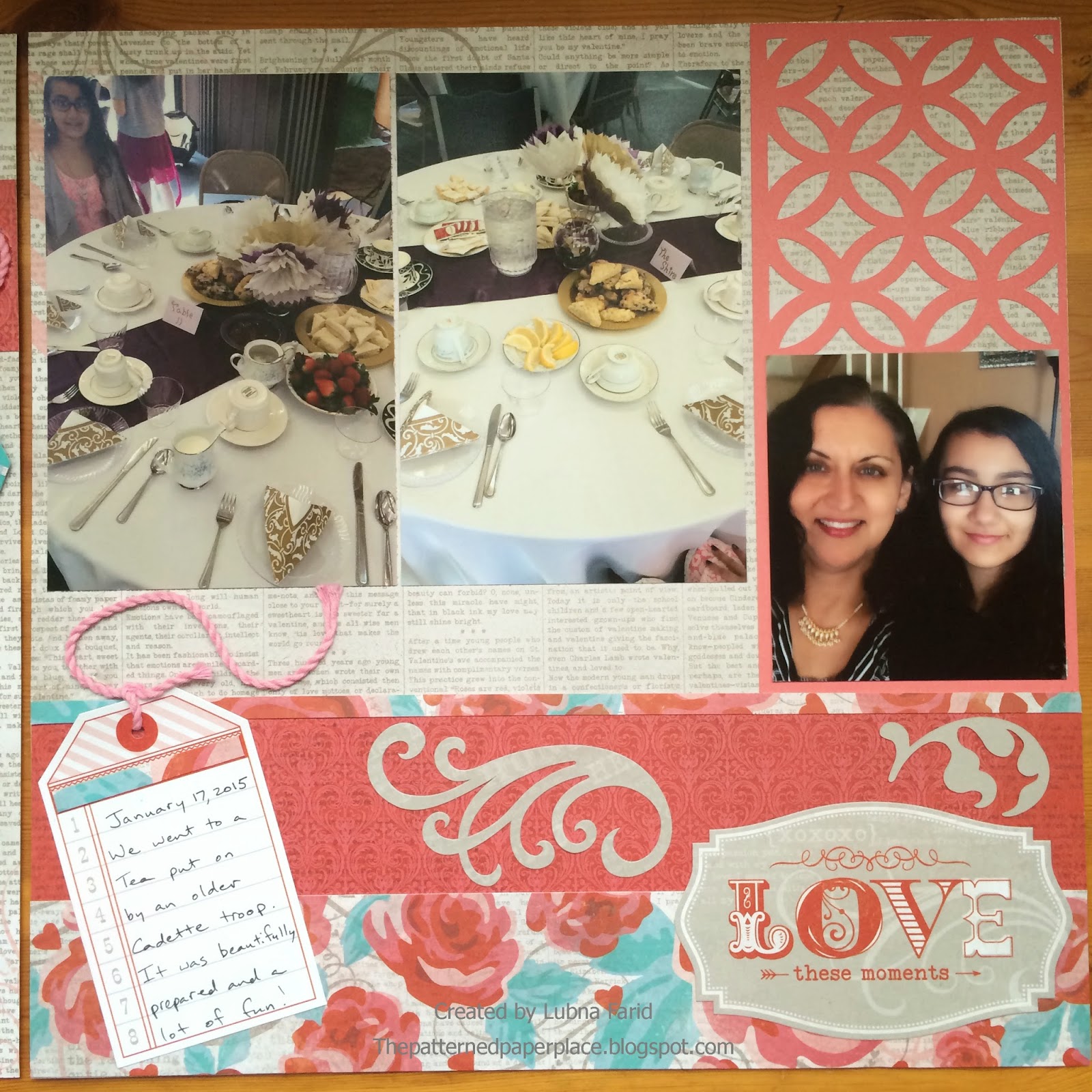
Now that we have some beautiful binder albums, it's easier than before for me to add my layouts directly to my album and move my layouts around. I've always liked including different types of layouts (divided page protectors along with the 12 x 12 page protectors) in my album and now I can see how it will look right away. I worked on a double layout today which has a regular undivided page protector on the left and a divided page protector on the right. Sorry for the quality of the last two photos. They have a glare from light reflecting off of the page protectors but I wanted to show you how they looked in the album.
Right side
Left side (divided)
The layouts side by side
I decided to use the divided page protector on the right as opposed to doing a large layout because I had photos from two different events. While I wanted to include the second event in my album, my pictures were not of great quality (took them from far away with my phone in a poorly lit room and then enlarged them) and I only ended up with two okay photos. Including them along with the other photos just seemed to make more sense than focusing on them in a whole other layout. I still wanted my layouts to look a little cohesive so I used the same paper pack, Snowhaven, one of my favorites and tried to repeat some elements, such as they way I did my journaling in a list format and in strips. The pocket card was cut from the Artfully Sent Cricut cartridge and the snowflakes were cut from the Art Philosophy Cricut cartridge. I also repeated using some Oceanside Sequins (these will be available starting April 1st) as bullets for my journaling list and as the centers of some of the snowflakes.
Here's a close up of the journaling block on the right with the snowflake and sequin detail.


